In this article i will show you how to create a custom glass button in wpf.
Step 1
Create a WPF Application and give the solution name as SolWPFGlassButton.
Step 2
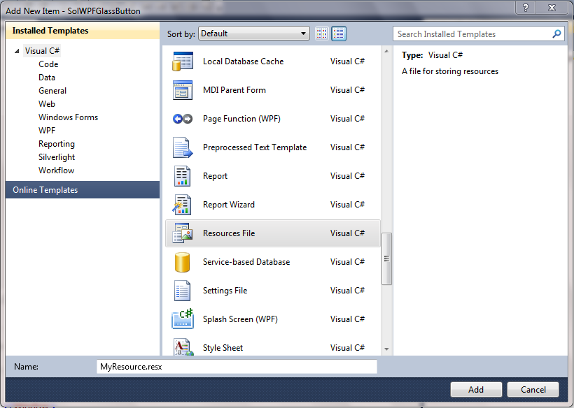
Add a Resource file in application.Right click on application from solution explorer, select Add New Item,Select Resources File from installed Visual Studio templates and name it MyResource.resx,it is look like this

Click on image for better view
In resource file we have to add image for set window background image,it is look like this

Click on image for better view
Step 3
Apply window background image,it is look like this
Step 5
Create a style for button control,it is look like this
Step 6
Apply style in button control,it is look like this

Click on image for better view
Full XAML Code
Download
Download Source Code
Step 1
Create a WPF Application and give the solution name as SolWPFGlassButton.
Step 2
Add a Resource file in application.Right click on application from solution explorer, select Add New Item,Select Resources File from installed Visual Studio templates and name it MyResource.resx,it is look like this
Click on image for better view
In resource file we have to add image for set window background image,it is look like this

Click on image for better view
Step 3
Apply window background image,it is look like this
 <Window.Background>
        <ImageBrush ImageSource="/Resources/Desert.jpg"></ImageBrush>
    </Window.Background>
Step 4
Add a Button control on window,it is look like this
<Grid>
        <Button Content="OK" Height="91.456" HorizontalAlignment="Left" Margin="87,91,0,0" Name="btnOK" VerticalAlignment="Top" Width="207.764" />

</Grid>
Step 5
Create a style for button control,it is look like this
<Window.Resources>

        <Style x:Key="btnGlass" TargetType="Button">

            <Setter Property="FontSize" Value="42" />
            <Setter Property="Foreground" Value="WhiteSmoke" />
            <Setter Property="Template">
                <Setter.Value>

                    <ControlTemplate TargetType="Button">
                        <Border x:Name="ButtonBorder"
                  CornerRadius="25"
                  BorderThickness="4"
                  Background="#AA4E4D4D"
                  BorderBrush="#99FFFFFF"
                  RenderTransformOrigin="0.5,0.5">
                            <Grid>
                                <Grid.RowDefinitions>
                                    <RowDefinition Height="*"/>
                                    <RowDefinition Height="1.7*"/>
                                </Grid.RowDefinitions>
                                <ContentPresenter x:Name="ButtonContentPresenter"
                                VerticalAlignment="Center"
                                HorizontalAlignment="Center"
                                Grid.RowSpan="2" />
                            </Grid>

                        </Border>

                        <ControlTemplate.Triggers>
                            <Trigger Property="IsPressed" Value="True">
                                <Setter Property="RenderTransform" TargetName="ButtonBorder">
                                    <Setter.Value>
                                        <TransformGroup>
                                            <ScaleTransform ScaleX="0.9" ScaleY="0.9"/>
                                        </TransformGroup>
                                    </Setter.Value>
                                </Setter>
                            </Trigger>
                        </ControlTemplate.Triggers>


                    </ControlTemplate>
                </Setter.Value>
            </Setter>
        </Style>


    </Window.Resources>
Step 6
Apply style in button control,it is look like this
<Grid>
        <Button Content="OK" Height="91.456" HorizontalAlignment="Left" Margin="87,91,0,0" Name="btnOK" VerticalAlignment="Top" Width="207.764" Style="{StaticResource btnGlass}" />
        </Grid>
Run the Project

Click on image for better view
Full XAML Code
<Window x:Class="SolWPFGlassButton.MainWindow"
        xmlns="http://schemas.microsoft.com/winfx/2006/xaml/presentation"
        xmlns:x="http://schemas.microsoft.com/winfx/2006/xaml"
        Title="Glass Button" Height="300" Width="400">

    <Window.Background>
        <ImageBrush ImageSource="/Resources/Desert.jpg"></ImageBrush>
    </Window.Background>

    <Window.Resources>

        <Style x:Key="btnGlass" TargetType="Button">

            <Setter Property="FontSize" Value="42" />
            <Setter Property="Foreground" Value="WhiteSmoke" />
            <Setter Property="Template">
                <Setter.Value>

                    <ControlTemplate TargetType="Button">
                        <Border x:Name="ButtonBorder"
                  CornerRadius="25"
                  BorderThickness="4"
                  Background="#AA4E4D4D"
                  BorderBrush="#99FFFFFF"
                  RenderTransformOrigin="0.5,0.5">
                            <Grid>
                                <Grid.RowDefinitions>
                                    <RowDefinition Height="*"/>
                                    <RowDefinition Height="1.7*"/>
                                </Grid.RowDefinitions>
                                <ContentPresenter x:Name="ButtonContentPresenter"
                                VerticalAlignment="Center"
                                HorizontalAlignment="Center"
                                Grid.RowSpan="2" />
                            </Grid>

                        </Border>

                        <ControlTemplate.Triggers>
                            <Trigger Property="IsPressed" Value="True">
                                <Setter Property="RenderTransform" TargetName="ButtonBorder">
                                    <Setter.Value>
                                        <TransformGroup>
                                            <ScaleTransform ScaleX="0.9" ScaleY="0.9"/>
                                        </TransformGroup>
                                    </Setter.Value>
                                </Setter>
                            </Trigger>
                        </ControlTemplate.Triggers>


                    </ControlTemplate>
                </Setter.Value>
            </Setter>
        </Style>


    </Window.Resources>

        <Grid>
        <Button Content="OK" Height="91.456" HorizontalAlignment="Left" Margin="87,91,0,0" Name="btnOK" VerticalAlignment="Top" Width="207.764" Style="{StaticResource btnGlass}" />
        </Grid>
</Window>
Download
Download Source Code
can i use same code for tow or more buttons in here?
ReplyDeleteYes..
ReplyDeleteJust Drag and Drop two or more button on window and apply style on button control,like this-
Style="{StaticResource btnGlass}"
Hey Kishor Thanks for sharing such a wonderful......
ReplyDeleteThanks Swapnil........
Delete