In this article i will show you how to create a Dynamic Image Gallery in Silverlight application.
Step 1
Create a Silverlight application and give the solution name as SolSilverlightImageGallery.
Step 2
Save images in Folder,Create a New Folder in the Solution and give folder name as Images,it is look like this

Click on image for better view
Step 3
Add XML file in the solution and give the file name as ImageData.xml,it is look like this

Click on image for better view
Step 4
The XML in the following example defines an XML document with a root node called Images. This root node contains one or more nodes called Image that include elements called
ImageName and ImagePath.
Create an ImageEntity Class in the solution,it is look like this
Add a System.Xml.Linq Assemble reference to the project.Right click on the project name in Solution Explorer, select Add Reference and Select System.Xml.Linq and select OK button,it is look like this
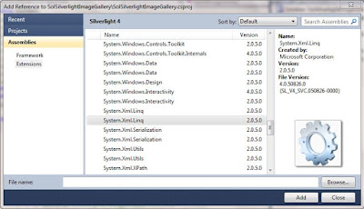 Click on image for better view
Step 7
Create a ImageView static class in a solution for retrieving data from XML document.it is look like this
Now design Image gallery on Page.Drag and drop ListBox Control from Toolbox and set a Background Color,it is look like this

Click on image for better view
Step 9
Create a UniformGrid control in silverlight for display images.Unfortunately UniformGrid Control does nor exists in silverlight aplication either in Silverlight SDK or in Silverlight ToolKit.
Create a class for UniformGrid Control,it is look like this
Add class reference in user control tag.so we can access uniformgrid control in XAML,it is look like this
Finally it is look like this
Step 11
Create a DataTemplate for ListBox Control in UserControl.Resource to bind Image Path and Image Name in Image and TextBlock Control,it is look like this
Step 12
Create a ItemPanelTemplate for ListBox Control to Display Images in uniformGrid Control,it is look like this
Finally DataTemplate and ItemPanelTemplate look like this
Step 13
Apply DataTemplate and ItemPanelTemplate on ListBox Control,it is look like this
ItemSource Property - Gets or sets a collection used to generate the content of the ItemsControl.
ItemTemplate Property - Gets or sets the DataTemplate used to display each item.
ItemPanel Property - Gets or sets the template that defines the panel that controls the layout of items.
Step 14
Now Bind the data in ListBox Control in Code Behind,it is look like this
Run the Project
Output

Click on image for better view
Move the Mouse Pointer to the Image

Full XAML Code
Download
Download Source Code
Step 1
Create a Silverlight application and give the solution name as SolSilverlightImageGallery.
Step 2
Save images in Folder,Create a New Folder in the Solution and give folder name as Images,it is look like this

Click on image for better view
Step 3
Add XML file in the solution and give the file name as ImageData.xml,it is look like this

Click on image for better view
Step 4
The XML in the following example defines an XML document with a root node called Images. This root node contains one or more nodes called Image that include elements called
ImageName and ImagePath.
Step 5![]()
Gaara ../Images/Gaara.png ![]()
Choji Akimichi ../Images/Choji.png ![]()
Jiraiya ../Images/Jiraiya.jpg ![]()
Kakashi Hatake ../Images/Kakashi.png ![]()
Kiba Inuzuka ../Images/Kiba.png ![]()
Naruto Uzumaki ../Images/Naruto.jpg ![]()
Neji Hyuuga ../Images/Neji.jpg ![]()
Rock Lee ../Images/RockLee.jpg ![]()
Sai ../Images/Sai.jpg ![]()
Shikamaru Nara ../Images/Shikamaru.jpg ![]()
Shino Aburame ../Images/Shino.jpg ![]()
Yamato ../Images/Yamato.jpg
Create an ImageEntity Class in the solution,it is look like this
using System;
using System.Net;
using System.Windows;
using System.Windows.Controls;
using System.Windows.Documents;
using System.Windows.Ink;
using System.Windows.Input;
using System.Windows.Media;
using System.Windows.Media.Animation;
using System.Windows.Shapes;

namespace SolSilverlightImageGallery
{
    public class ImageEntity
    {

        #region property

        public String ImageName
        {
            get;
            set;
        }

        public String ImagePath
        {
            get;
            set;
        }

        #endregion

    }
}
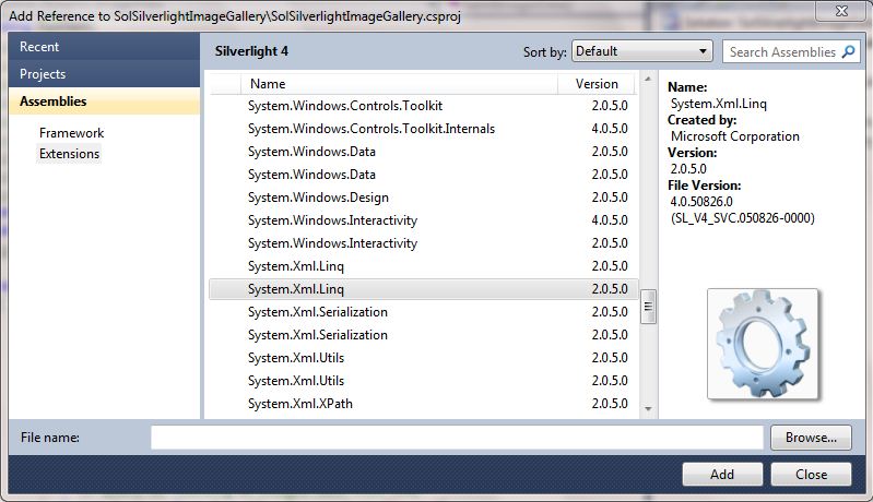
Step 6Add a System.Xml.Linq Assemble reference to the project.Right click on the project name in Solution Explorer, select Add Reference and Select System.Xml.Linq and select OK button,it is look like this
Step 7
Create a ImageView static class in a solution for retrieving data from XML document.it is look like this
using System;
using System.Net;
using System.Windows;
using System.Windows.Controls;
using System.Windows.Documents;
using System.Windows.Ink;
using System.Windows.Input;
using System.Windows.Media;
using System.Windows.Media.Animation;
using System.Windows.Shapes;
using System.Collections.Generic;
using System.Xml.Linq;
using System.Linq;

namespace SolSilverlightImageGallery
{
    public static class ImagesView
    {
        public static List<ImageEntity> GetAllImagesData()
        {
            try
            {
                // Load Xml Document
                XDocument XDoc = XDocument.Load("ImageData.xml");

                // Query for retriving all Images data from XML
                var Query = from Q in XDoc.Descendants("Image")
                            select new ImageEntity
                            {
                                ImageName = Q.Element("ImageName").Value,
                                ImagePath = Q.Element("ImagePath").Value
                            };

                // return images data
               return Query.ToList<ImageEntity>();

            }
            catch (Exception ex)
            {
                throw new Exception(ex.Message);
            }
        }
    }
}
Step 8Now design Image gallery on Page.Drag and drop ListBox Control from Toolbox and set a Background Color,it is look like this
<Grid x:Name="LayoutRoot">
  <ListBox x:Name="LsImageGallery">
   <ListBox.Background>
    <LinearGradientBrush EndPoint="0.5,1" StartPoint="0.5,0">
     <GradientStop Color="Black"/>
     <GradientStop Color="#FF1E2A2F" Offset="1"/>
    </LinearGradientBrush>
   </ListBox.Background>

  </ListBox>
 </Grid>

Click on image for better view
Step 9
Create a UniformGrid control in silverlight for display images.Unfortunately UniformGrid Control does nor exists in silverlight aplication either in Silverlight SDK or in Silverlight ToolKit.
Create a class for UniformGrid Control,it is look like this
using System;
using System.Net;
using System.Windows;
using System.Windows.Controls;
using System.Windows.Documents;
using System.Windows.Ink;
using System.Windows.Input;
using System.Windows.Media;
using System.Windows.Media.Animation;
using System.Windows.Shapes;

namespace SolSilverlightImageGallery
{
    public class UniformGrid : Panel
    {
        ///
        /// Gets or sets the computed row value.
        ///
        private int ComputedRows { get; set; }

        ///
        /// Gets or sets the computed column value.
        ///
        private int ComputedColumns { get; set; }

        ///
        /// Initializes a new instance of UniformGrid.
        ///
        public UniformGrid()
        {
        }

        ///
        /// Gets or sets the number of first columns to leave blank.
        ///
        public int FirstColumn
        {
            get { return (int)GetValue(FirstColumnProperty); }
            set { SetValue(FirstColumnProperty, value); }
        }

        ///
        /// The FirstColumnProperty dependency property.
        ///
        public static readonly DependencyProperty FirstColumnProperty =
                DependencyProperty.Register(
                        "FirstColumn",
                        typeof(int),
                        typeof(UniformGrid),
                        new PropertyMetadata(0, OnIntegerDependencyPropertyChanged));

        ///
        /// Gets or sets the number of columns in the grid. A value of zero
        /// indicates that the count should be dynamically computed based on the
        /// number of rows and the number of non-collapsed children in the grid.
        ///
        public int Columns
        {
            get { return (int)GetValue(ColumnsProperty); }
            set { SetValue(ColumnsProperty, value); }
        }

        ///
        /// DependencyProperty for the Columns property.
        ///
        public static readonly DependencyProperty ColumnsProperty =
                DependencyProperty.Register(
                        "Columns",
                        typeof(int),
                        typeof(UniformGrid),
                        new PropertyMetadata(0, OnIntegerDependencyPropertyChanged));

        ///
        /// Validate the new property value and silently revert if the new value
        /// is not appropriate. Used in place of WPF value coercian by the
        /// dependency properties in UniformGrid.
        ///
        ///


The dependency object.
        ///


The dependency property.
        private static void OnIntegerDependencyPropertyChanged(DependencyObject o, DependencyPropertyChangedEventArgs e)
        {
            // Silently coerce the value back to >= 0 if negative.
            if (!(e.NewValue is int) || (int)e.NewValue < 0)
            {
                o.SetValue(e.Property, e.OldValue);
            }
        }

        ///
        /// Gets or sets the number of rows in the grid. A value of zero
        /// indicates that the row count should be dynamically computed based on
        /// the number of columns and the number of non-collapsed children in
        /// the grid.
        ///
        public int Rows
        {
            get { return (int)GetValue(RowsProperty); }
            set { SetValue(RowsProperty, value); }
        }

        ///
        /// The Rows DependencyProperty.
        ///
        public static readonly DependencyProperty RowsProperty =
                DependencyProperty.Register(
                        "Rows",
                        typeof(int),
                        typeof(UniformGrid),
                        new PropertyMetadata(0, OnIntegerDependencyPropertyChanged));

        ///
        /// Compute the desired size of the UniformGrid by measuring all of the
        /// children with a constraint equal to a cell's portion of the given
        /// constraint. The maximum child width and maximum child height are
        /// tracked, and then the desired size is computed by multiplying these
        /// maximums by the row and column count.
        ///
        ///


The size constraint.
        /// Returns the desired size.
        protected override Size MeasureOverride(Size constraint)
        {
            UpdateComputedValues();

            Size childConstraint = new Size(constraint.Width / ComputedColumns, constraint.Height / ComputedRows);
            double maxChildDesiredWidth = 0.0;
            double maxChildDesiredHeight = 0.0;

            //  Measure each child, keeping track of max desired width & height.
            for (int i = 0, count = Children.Count; i < count; ++i)
            {
                UIElement child = Children[i];
                child.Measure(childConstraint);
                Size childDesiredSize = child.DesiredSize;
                if (maxChildDesiredWidth < childDesiredSize.Width)
                {
                    maxChildDesiredWidth = childDesiredSize.Width;
                }
                if (maxChildDesiredHeight < childDesiredSize.Height)
                {
                    maxChildDesiredHeight = childDesiredSize.Height;
                }
            }
            return new Size((maxChildDesiredWidth * ComputedColumns), (maxChildDesiredHeight * ComputedRows));
        }

        ///
        /// Arrange the children of the UniformGrid by distributing space evenly
        /// among the children, making each child the size equal to a cell
        /// portion of the arrangeSize parameter.
        ///
        ///


The arrange size.
        /// Returns the updated Size.
        protected override Size ArrangeOverride(Size arrangeSize)
        {
            Rect childBounds = new Rect(0, 0, arrangeSize.Width / ComputedColumns, arrangeSize.Height / ComputedRows);
            double xStep = childBounds.Width;
            double xBound = arrangeSize.Width - 1.0;
            childBounds.X += childBounds.Width * FirstColumn;

            // Arrange and Position each child to the same cell size
            foreach (UIElement child in Children)
            {
                child.Arrange(childBounds);
                if (child.Visibility != Visibility.Collapsed)
                {
                    childBounds.X += xStep;
                    if (childBounds.X >= xBound)
                    {
                        childBounds.Y += childBounds.Height;
                        childBounds.X = 0;
                    }
                }
            }

            return arrangeSize;
        }

        ///
        /// If the Rows or Columns values are set to 0, dynamically compute the
        /// values based on the actual number of non-collapsed children.
        ///
        ///
        /// In the case when both Rows and Columns are set to 0, the Rows and
        /// Columns will be equal, laying out a square grid.
        ///
        private void UpdateComputedValues()
        {
            ComputedColumns = Columns;
            ComputedRows = Rows;

            // Reset the first column. This is the same logic performed by WPF.
            if (FirstColumn >= ComputedColumns)
            {
                FirstColumn = 0;
            }

            if ((ComputedRows == 0) || (ComputedColumns == 0))
            {
                int nonCollapsedCount = 0;
                for (int i = 0, count = Children.Count; i < count; ++i)
                {
                    UIElement child = Children[i];
                    if (child.Visibility != Visibility.Collapsed)
                    {
                        nonCollapsedCount++;
                    }
                }
                if (nonCollapsedCount == 0)
                {
                    nonCollapsedCount = 1;
                }
                if (ComputedRows == 0)
                {
                    if (ComputedColumns > 0)
                    {
                        ComputedRows = (nonCollapsedCount + FirstColumn + (ComputedColumns - 1)) / ComputedColumns;
                    }
                    else
                    {
                        ComputedRows = (int)Math.Sqrt(nonCollapsedCount);
                        if ((ComputedRows * ComputedRows) < nonCollapsedCount)
                        {
                            ComputedRows++;
                        }
                        ComputedColumns = ComputedRows;
                    }
                }
                else if (ComputedColumns == 0)
                {
                    ComputedColumns = (nonCollapsedCount + (ComputedRows - 1)) / ComputedRows;
                }
            }
        }
    }
}
Step 10Add class reference in user control tag.so we can access uniformgrid control in XAML,it is look like this
xmlns:Local="clr-namespace:SolSilverlightImageGallery"
Finally it is look like this
<UserControl
 xmlns="http://schemas.microsoft.com/winfx/2006/xaml/presentation"
 xmlns:x="http://schemas.microsoft.com/winfx/2006/xaml"
 xmlns:d="http://schemas.microsoft.com/expression/blend/2008"
 xmlns:mc="http://schemas.openxmlformats.org/markup-compatibility/2006"
 xmlns:Local="clr-namespace:SolSilverlightImageGallery"
 mc:Ignorable="d"
 x:Class="SolSilverlightImageGallery.MainPage"
 d:DesignWidth="640" d:DesignHeight="480">
Step 11
Create a DataTemplate for ListBox Control in UserControl.Resource to bind Image Path and Image Name in Image and TextBlock Control,it is look like this
<DataTemplate x:Key="ImageGalleryDataTemplate">
   <Grid>
    <Grid.RowDefinitions>
     <RowDefinition Height="0.833*"/>
     <RowDefinition Height="0.167*"/>
    </Grid.RowDefinitions>

    <Border Grid.Row="0" Grid.Column="0" BorderBrush="#FFADABA8" BorderThickness="2"  Width="200" Height="150" Padding="10" Margin="10" CornerRadius="10">
     <!--Bind Image Path in Image Control-->
     <Image Source="{Binding ImagePath}" Stretch="Fill"  HorizontalAlignment="Center">
      <!--View Large Image on Image Control Tooltip-->
      <ToolTipService.ToolTip>
       <Grid>
        <Image Source="{Binding ImagePath}" Stretch="Fill" HorizontalAlignment="Center" Height="300" Width="300"></Image>
       </Grid>
      </ToolTipService.ToolTip>
     </Image>
    </Border>
     <!--Bind Image Name in TextBlock Control-->
    <TextBlock Grid.Row="1" Grid.Column="0" Text="{Binding ImageName}"  Foreground="Orange" HorizontalAlignment="Center"></TextBlock>

   </Grid>
  </DataTemplate>
Step 12
Create a ItemPanelTemplate for ListBox Control to Display Images in uniformGrid Control,it is look like this
<ItemsPanelTemplate x:Key="ImageGalleryItemsPanelTemplate">

   <!--Display Images on UniformGrid Panel-->
   <Local:UniformGrid Columns="4" HorizontalAlignment="Center" VerticalAlignment="Stretch"></Local:UniformGrid>

  </ItemsPanelTemplate>
Finally DataTemplate and ItemPanelTemplate look like this
<UserControl.Resources>
  <DataTemplate x:Key="ImageGalleryDataTemplate">
   <Grid>
    <Grid.RowDefinitions>
     <RowDefinition Height="0.833*"/>
     <RowDefinition Height="0.167*"/>
    </Grid.RowDefinitions>

    <Border Grid.Row="0" Grid.Column="0" BorderBrush="#FFADABA8" BorderThickness="2"  Width="200" Height="150" Padding="10" Margin="10" CornerRadius="10">
     <!--Bind Image Path in Image Control-->
     <Image Source="{Binding ImagePath}" Stretch="Fill"  HorizontalAlignment="Center">
      <!--View Large Image on Image Control Tooltip-->
      <ToolTipService.ToolTip>
       <Grid>
        <Image Source="{Binding ImagePath}" Stretch="Fill" HorizontalAlignment="Center" Height="300" Width="300"></Image>
       </Grid>
      </ToolTipService.ToolTip>
     </Image>
    </Border>
     <!--Bind Image Name in TextBlock Control-->
    <TextBlock Grid.Row="1" Grid.Column="0" Text="{Binding ImageName}"  Foreground="Orange" HorizontalAlignment="Center"></TextBlock>

   </Grid>
  </DataTemplate>

  <ItemsPanelTemplate x:Key="ImageGalleryItemsPanelTemplate">

   <!--Display Images on UniformGrid Panel-->
   <Local:UniformGrid Columns="4" HorizontalAlignment="Center" VerticalAlignment="Stretch"></Local:UniformGrid>

  </ItemsPanelTemplate>
 </UserControl.Resources>
Step 13
Apply DataTemplate and ItemPanelTemplate on ListBox Control,it is look like this
<ListBox x:Name="LsImageGallery" ItemsSource="{Binding}" ItemTemplate="{StaticResource ImageGalleryDataTemplate}" ItemsPanel="{StaticResource ImageGalleryItemsPanelTemplate}">
   <ListBox.Background>
    <LinearGradientBrush EndPoint="0.5,1" StartPoint="0.5,0">
     <GradientStop Color="Black"/>
     <GradientStop Color="#FF1E2A2F" Offset="1"/>
    </LinearGradientBrush>
   </ListBox.Background>

  </ListBox>
ItemSource Property - Gets or sets a collection used to generate the content of the ItemsControl.
ItemTemplate Property - Gets or sets the DataTemplate used to display each item.
ItemPanel Property - Gets or sets the template that defines the panel that controls the layout of items.
Step 14
Now Bind the data in ListBox Control in Code Behind,it is look like this
using System;
using System.Windows;
using System.Windows.Controls;
using System.Windows.Documents;
using System.Windows.Ink;
using System.Windows.Input;
using System.Windows.Media;
using System.Windows.Media.Animation;
using System.Windows.Shapes;
using System.Collections.Generic;

namespace SolSilverlightImageGallery
{
 public partial class MainPage : UserControl
 {
  public MainPage()
  {
   // Required to initialize variables
   InitializeComponent();

   try
   {
    BindImages(); // Call Bind Image Function
   }
   catch (Exception ex)
   {
    MessageBox.Show(ex.Message);
   }
  }

  /// <summary>
  /// Bind Images in List Box
  /// </summary>
  private void BindImages()
  {
   try
   {
    // Store Data in List Box.
    List<ImageEntity> ListImagesObj = ImagesView.GetAllImagesData();

    // Check the List Object Count
    if (ListImagesObj.Count > 0)
    {
     // Bind data in List Box
     LsImageGallery.DataContext = ListImagesObj;
    }
   }
   catch (Exception ex)
   {
    throw new Exception(ex.Message);
   }
  }
 }
}
Run the Project
Output

Click on image for better view
Move the Mouse Pointer to the Image

Full XAML Code
<UserControl
 xmlns="http://schemas.microsoft.com/winfx/2006/xaml/presentation"
 xmlns:x="http://schemas.microsoft.com/winfx/2006/xaml"
 xmlns:d="http://schemas.microsoft.com/expression/blend/2008"
 xmlns:mc="http://schemas.openxmlformats.org/markup-compatibility/2006"
 xmlns:Local="clr-namespace:SolSilverlightImageGallery"
 mc:Ignorable="d"
 x:Class="SolSilverlightImageGallery.MainPage"
 d:DesignWidth="640" d:DesignHeight="480">

 <UserControl.Resources>
  <DataTemplate x:Key="ImageGalleryDataTemplate">
   <Grid>
    <Grid.RowDefinitions>
     <RowDefinition Height="0.833*"/>
     <RowDefinition Height="0.167*"/>
    </Grid.RowDefinitions>

    <Border Grid.Row="0" Grid.Column="0" BorderBrush="#FFADABA8" BorderThickness="2"  Width="200" Height="150" Padding="10" Margin="10" CornerRadius="10">
     <!--Bind Image Path in Image Control-->
     <Image Source="{Binding ImagePath}" Stretch="Fill"  HorizontalAlignment="Center">
      <!--View Large Image on Image Control Tooltip-->
      <ToolTipService.ToolTip>
       <Grid>
        <Image Source="{Binding ImagePath}" Stretch="Fill" HorizontalAlignment="Center" Height="300" Width="300"></Image>
       </Grid>
      </ToolTipService.ToolTip>
     </Image>
    </Border>
     <!--Bind Image Name in TextBlock Control-->
    <TextBlock Grid.Row="1" Grid.Column="0" Text="{Binding ImageName}"  Foreground="Orange" HorizontalAlignment="Center"></TextBlock>

   </Grid>
  </DataTemplate>

  <ItemsPanelTemplate x:Key="ImageGalleryItemsPanelTemplate">

   <!--Display Images on UniformGrid Panel-->
   <Local:UniformGrid Columns="4" HorizontalAlignment="Center" VerticalAlignment="Stretch"></Local:UniformGrid>

  </ItemsPanelTemplate>
 </UserControl.Resources>

 <Grid x:Name="LayoutRoot">
  <ListBox x:Name="LsImageGallery" ItemsSource="{Binding}" ItemTemplate="{StaticResource ImageGalleryDataTemplate}" ItemsPanel="{StaticResource ImageGalleryItemsPanelTemplate}">
   <ListBox.Background>
    <LinearGradientBrush EndPoint="0.5,1" StartPoint="0.5,0">
     <GradientStop Color="Black"/>
     <GradientStop Color="#FF1E2A2F" Offset="1"/>
    </LinearGradientBrush>
   </ListBox.Background>

  </ListBox>
 </Grid>
</UserControl>
Download
Download Source Code
the download link is not workinbg fine plz check and update
ReplyDeleteNow is working fine.please check and confirm.
DeleteHi kishor,
ReplyDeletenice article but am not getting the output as specified..... am jus getting a black screen. please help me im new to silverlight.
Thanks,
Praveen
Can you send your solution copy to me????
DeleteYea sure........ will send it to your mail id.
DeleteThanks
Thanks for sending you solution copy.
DeleteI checked your code.you did not put correct data on XML file that's why images not viewing on page.
i solved your query and send a fresh solution copy to your mail id.
also i have that problem.. plzz help..
Deletei need help soon... plzzzz
Send your Solution Copy on my mail ID.
Deletekishor.naik011.net@gmail.com
Thanks a lot for your help.... solution you gave works like a charm. Nice article
ReplyDeleteMost Welcome Praveen..
Deletehey bro,
ReplyDeleteI have a issue in WPF,we are using 16bit and developed application for client
The client are getting different colours on the screen but we are unable to stimulate them in our monitor.
Can you help me with this issue..
Hello Kishor Naik
ReplyDeletecan you tell me how to save files in folder in silverlight using WCF service
You have to use XML files but i doo not want to use XML files
Regards
Amit Bansal
amit.csc09@gmail.com